| Bedroom
Get into a good sleep routine as the season changes
Getting into a good sleep routine can take time.

Have you ever walked into a bedroom and felt instantly at peace, like the room was designed just for you? Chances are, the colour scheme played a significant role in creating that feeling.
Here are some of the best complementary bedroom design colour schemes to help you feel your best.
If neutral tones aren't your bag, you might be wondering how you can still evoke feelings of serenity without forgoing the colour. The answer to that is complementary colour schemes.
Complementary colours are opposite each other on a colour wheel. According to colour theory, when these colours are mixed, they cancel each other out. This means you have a colour that's akin to black or white. While it may sound odd, this cancelling out of colour is why some colourful bedroom designs work beautifully – and others don't.
Considered colour schemes enhance your bedroom's energy and help you create a space that's radiant yet harmonious. Complementary colours can also be excellent if you want to enhance certain features in your bedroom. Ornate architraves, cosy nooks and high ceilings can be emphasised as you add depth and dimension with colour.
While it's easy to shy away from colour in your bedroom, if you're brave enough, complementary colour schemes can transform it into a visually pleasing, comforting retreat.
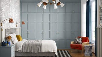
This combination is a classic. And for good reason. Blue and orange, when mixed, create a balance between hot and cold. For a toned-down look, pair blue walls with an orange-hue wooden floor. For something a little bolder, experiment with dark navy walls and burnt orange accessories.
While reminiscent of Christmas, there's no reason why you can't pair green and red together all year round!
Green is associated with tranquillity and nature, so it's excellent if you're hoping to create a calming retreat. As it's a soothing colour, green can almost always be used as the dominant colour for walls or large furniture pieces. Natural elements like plants – as well as being good for your health – can enhance the green tones, adding to the room's calming ambience.
Red is a stimulating, warm colour, so is best used in accents like pillows, throws or your favourite abstract artwork.
To avoid overwhelming the space, balance the intensity of both colours. For maximalists, forest green and cherry red are opulent and cosy. If you'd rather keep to muted tones or pastels, you can't go wrong with mint green and dusky pink.
Don't forget to commit to this colour scheme completely for a bold yet cohesive look. Everything from your fitted wardrobes to your flooring should be considered. Luckily, our green fitted wardrobes mean your furniture will never compromise your creative vision.
Hear us out: purple and yellow can work. Honestly!
Yes, it's brave, dynamic and stimulating. But it's more than that. Purple is linked to opulence – but also calmness. On the other hand, yellow is associated with happiness and energy. While it's not for the faint-hearted, this unique colour combination balances the calming effect of purple with the uplifting feel of yellow, creating a cohesive scheme.
To prevent your bedroom from becoming overly stimulating, consider using softer shades or pastels. Delicate lavenders and bold mustards work wonders when paired, as do deep purples and dainty pastel yellows.
Turquoise and coral will give your room a lively ambience. This colour combination is particularly well-suited for beachside properties or tropical bedroom themes.
Reminiscent of the clear blue waters of the Mediterranean, turquoise can be used anywhere: on your walls, bed linens or rugs. Blue is a fresh and soothing colour, so you won't go overboard when designing your bedroom.
Bright coral tones can be introduced into the scheme (preferably in smaller doses) via strategically placed cushions, prints or accents. This combination gives your retreat a beachy, tropical feel. To keep your bedroom from feeling too bold, use neutral white or beige to soften the palette.
A balanced monochromatic bedroom isn't easy to achieve, but if you can master it, the payoff can be tremendous.
The stark contrast between black and white adds drama and sophistication to your bedroom. Crisp, white bedding paired with black furniture, frames or accents add depth and definition to any space.
To avoid a sterile look, incorporate textures through fabrics such as velvet, linen, wood or faux fur. Alternatively, black and white can serve as a backdrop when introducing pops of colour, like burnt orange.
Getting into a good sleep routine can take time.

Walnut and espresso finishes offer deep, warm tones that bring instant sophistication and timeless appeal, adding depth and character to any space.

The slow living trend offers something radically different in a world that prioritises speed, productivity and constant connection.
Whether you have an exact vision in tow, or are just at the beginning stage of your home renovation, we have heaps of inspiration for you to get stuck into.
Find a wealth of design tips, trends and inspiration in the pages of our brochure, magazine and on our blog. Our experts are always ready to help you create dream home, pop in store or book your free design visit for experts to help on bringing your vision to life.