How to create a reading nook in your bedroom
2026 is the year that we're creating calm, soothing spaces.


Are you familiar with the name Pantone? The Pantone Colour Systems are used in design and manufacturing to classify, communicate and match colour. They’re relied upon across the world, and each year the brand selects a specific shade for the 12 months ahead that goes on to influence trends in interior design, fashion and more.
In recent years we’ve had the vibrant ‘Living Coral’, a deep ‘Ultra Violet’, and the vivid ‘Greenery’. The colour experts take their pick based on trends in entertainment, lifestyle, technology, and even socio-economic conditions – anything that captures attention and influences the way we live.
And of course, its impact permeates into our homes. Here, our expert team discusses four different ways to incorporate the Pantone Colour of the Year 2020 into yours.
But first of all…
This time round it’s Classic Blue! ‘Instilling calm, confidence and connection, this enduring blue highlights our desire for a dependable and stable foundation on which to build as we cross the threshold into a new era.’
Much like the sky as dusk sets in, Classic Blue offers a sense of peace and serenity that’s appreciated the world over. A 2015 YouGov survey found blue to be the most popular colour across four continents, making this year’s tone a universally popular choice.
And its versatility means our designers aren’t short of ideas for ways you can use it to refresh your interior.
“Feature walls are the perfect way to add a splash of colour to a living room or bedroom without it taking over. Your home should be an oasis of calm, a sanctuary from hectic modern life – and Classic Blue fits the bill perfectly.” – Josh, Hammonds designer
As a general rule, feature walls are at their most effective when they’re used to frame the focal point of a room. This could be your TV or a large window in your living room, or alternatively behind the headboard in your bedroom. Ideally your connecting walls will be white, cream or another neutral colour so as not to become overwhelming.
“Statement furniture has been a growing trend recently, with 2019 being the year of black furnishings and fittings. We’ve covered how to use it to create depth and drama when paired with neutral coloured walls and industrial accessories in our autumn 2019 trends article. Tweak this sophisticated aesthetic with Classic Blue to give your home a slightly more Scandinavian feel.” – Heather, Hammonds designer
Statement furniture covers any piece that draws and dominates attention. Think unique materials, contrasting colours, and interesting sizes or shapes. You could incorporate Classic Blue with a vintage velvet sofa, for example, or breathe new life into an old chest of drawers by giving it a lick of paint.

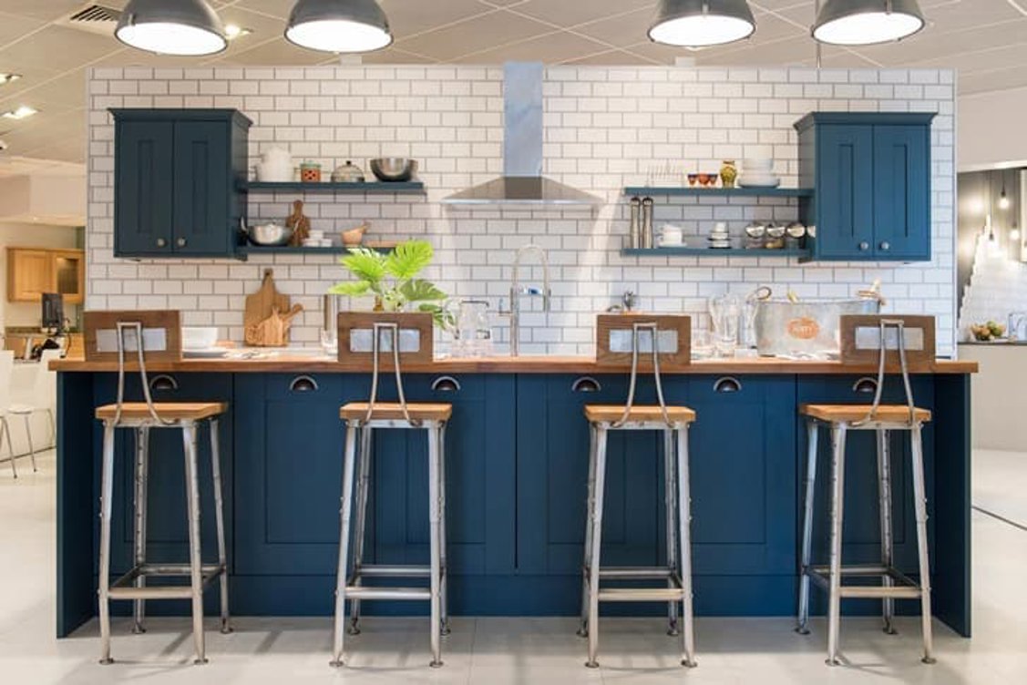
“Darker coloured kitchens have also been growing in popularity as homeowners look for simple ways to spice up their cooking space. Whether you run Classic Blue through your cabinetry or work surfaces, balance it with whites or blacks to maintain chemistry.”– Josh, Hammonds designer
For many people, cooking can be a relaxing activity that soothes the mind and body at the end of a busy day. For others, having to prepare a meal only adds to the stress. But when done in an environment infused with Classic Blue, you could find your anxieties reducing – and perhaps your cooking skills will improve too!
“If there’s any room in your home that should exude calm and composure, it has to be the bedroom. Here you don’t have to limit Classic Blue to one or two features; you can just as easily create a coherent theme through your bedding, throws and side table accessories such as lamps and vases.” – Heather, Hammonds designer
The bedroom is usually the most private and personal space in the home; a place you retire to when you’re worn out by the kids, need a break from your guests or fancy an early night alone. Like the late evening sky, a Classic Blue theme will contribute to feelings of the day winding down. Pair it with Dust Grey furniture – available in several of our fitted wardrobe ranges - to create a truly complementary sleep space.
Do you have plans to incorporate the Pantone Colour of the Year 2020 into your home? Try out one or several of our design team’s tips to follow the trend with style.
And if you’re looking for more ideas and inspiration, you can keep browsing our blog to find everything from practical guides to real room makeovers.

2026 is the year that we're creating calm, soothing spaces.

Getting into a good sleep routine can take time.

Walnut and espresso finishes offer deep, warm tones that bring instant sophistication and timeless appeal, adding depth and character to any space.
Whether you have an exact vision in tow, or are just at the beginning stage of your home renovation, we have heaps of inspiration for you to get stuck into.
Find a wealth of design tips, trends and inspiration in the pages of our brochure, magazine and on our blog. Our experts are always ready to help you create dream home, pop in store or book your free design visit for experts to help on bringing your vision to life.